Many traders start with MACD because it is easy and familiar, but the longer they trade, the more they realize one issue: signals often come late, after price has already moved a significant distance. Meanwhile, the MACD histogram can reveal market momentum shifts earlier, acting like an “early warning system” before an actual crossover appears. This is also where many important signals are often overlooked, because MACD does not clearly show them through visual cues. Today’s PF Insight article will provide an overview of how the MACD histogram reflects momentum shifts and suggest how to read the most basic signals.
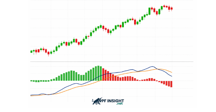
The MACD histogram is the set of “bar columns” within the MACD indicator, and it is the part that most visually reflects the strength or weakness of market momentum at any given time. Instead of only watching the MACD and Signal lines cross, the histogram allows you to observe whether the distance between these two lines is expanding or contracting, helping you sense whether the trend is strengthening or starting to weaken.
How is the MACD histogram formed?
In essence, the histogram equals the difference between the MACD line and the Signal line. When the two lines move farther apart, the histogram bars become taller; when they move closer together, the histogram gradually shrinks. This is why the histogram is often seen as a “speed gauge” for MACD, because it shows whether changes are accelerating or slowing down before you can even see a crossover signal.
What do positive and negative histogram values mean?
The histogram is positive when the MACD line is above the Signal line, meaning momentum is tilted to the upside. Conversely, the histogram is negative when the MACD line is below the Signal line, indicating momentum is tilted to the downside. The key is not only whether the histogram is positive or negative, but also whether the bars are rising or falling, because that is what reveals whether momentum is accelerating or starting to weaken.
Why MACD is a “lagging” indicator, while the histogram reveals what MACD does not show in advance
Many people use MACD as a trend confirmation tool, but its biggest drawback is that signals often appear late. This is because MACD is based on moving averages, so it needs time to “catch up” with price movement, causing traders to enter after the market has already moved a considerable distance.
Why are MACD crossover signals often delayed?
Both the MACD line and the Signal line are built from EMAs (Exponential Moving Averages), meaning price must move long enough for these lines to shift clearly and form a crossover. Simply put, a crossover is not a leading signal, but often the end result of a price move that has already happened. That is why waiting for a MACD cross before acting can easily lead to late entries, less favorable entry points, and weaker reward-to-risk.
How does the histogram reflect momentum faster?
While MACD is slow because it requires a clear crossover, the MACD histogram shows momentum changing throughout the process as the two lines move closer together or farther apart. The histogram often “turns” earlier. For example, when bars have been rising strongly and then start shrinking, it signals that trend strength is weakening even though no crossover has occurred yet. That is why the histogram acts like an early warning signal: it does not wait for a final “confirmation,” but reflects momentum slowing down or speeding up as soon as it begins.
Logical example
Imagine the market is trending upward and the histogram bars keep getting taller. At some point, you notice the histogram bars are no longer making new highs and instead begin shrinking, even though the MACD line has not crossed below the Signal line yet. This shows that the distance between the two lines is starting to contract, meaning bullish momentum is slowing down. When the histogram weakens like this, it is often an early sign that the MACD line is moving closer to the Signal line and a crossover may be approaching.
The histogram peaks and then gradually contracts (shifting from green to red) before the MACD and Signal lines cross. This is an early sign that bullish momentum is weakening.
How to read the MACD histogram to identify shifts in market momentum
If the MACD line and Signal line give you a “conclusion” through a crossover signal, the MACD histogram shows you the step-by-step momentum change process. The biggest advantage of reading the histogram is that you do not need to wait for a crossover. Instead, you can observe whether the trend is “gaining strength” or “losing strength” while price is still moving.
What is the market telling you when the histogram rises or falls?
Start by looking at the height of the histogram bars over time:
Rising histogram: the distance between the MACD line and the Signal line is expanding → momentum is strengthening, and the current trend is becoming “healthier.”
Falling histogram: the distance between the two lines is contracting → momentum is weakening, and the trend may slow down, shift phase, or prepare for a reversal.
In other words, the histogram acts like a “speedometer” for the trend. The trend may still be going up, but if the histogram starts shrinking, it is a sign that the upward move is losing speed.
“Momentum peak” and early weakening signals
One of the most important ways to read the MACD histogram is by identifying a momentum peak. This is the point where the histogram reaches its highest level within a phase, and then:
The bars stop making higher highs
And begin contracting
This often happens before the MACD and Signal lines cross, because the histogram reflects momentum in real time. When the histogram contracts after a strong expansion, it suggests that buying pressure is weakening, the market is entering a “running out of steam” stage, and the risk of a pullback increases. This is exactly why the histogram is seen as a tool that helps traders spot momentum shifts earlier, rather than relying only on the MACD confirmation signal.
Hidden trading signals from the MACD histogram
The interesting thing about the MACD histogram is that it not only shows whether a trend is strong or weak, but also “reveals” momentum reversal signals before traders can see a MACD crossover. If MACD is like the final confirmation signal, the histogram is often where the “first sign” appears that the market is changing rhythm.
Core signal: one histogram bar is lower than the previous bar
This is the most important signal, and it is also what many traders overlook. In a sequence where the histogram is rising (momentum strengthening), there will be a point where: one histogram bar stops making a higher high, and a bar appears that is lower than the bar immediately before it.
Even this small change carries a major meaning: momentum is starting to weaken, which means the market may be entering a slowdown phase. This often happens while price is still trending, but the driving force is no longer as strong as before. That is why it is considered an “early signal” that helps traders prepare in advance, instead of waiting for a MACD cross to appear before reacting.
How to read histogram sequences to avoid noise
Not every lower bar is an immediate trading signal, because the histogram can fluctuate slightly and create noise. The correct approach is to read the histogram as a sequence:
When the histogram is strong (bars rising steadily with clear height), you wait for a “lower bar” signal to recognize a momentum shift.
When the histogram keeps contracting toward the zero line, it is often a sign that the market is shifting phases, trend strength is fading, and a balance state is beginning to form.
In short, the histogram does not only tell you “when to act,” but also helps you understand what momentum stage the market is in: accelerating, decelerating, or preparing to shift direction. This is exactly the part that traditional MACD does not clearly communicate.
How to use the MACD histogram as a trading signal
After understanding how the histogram reflects momentum and learning to identify “hidden signals,” the next step is turning it into clear trading rules. The key point to remember is this: the MACD histogram is not a tool for guessing tops and bottoms, but a tool that helps you catch momentum shifts earlier and enter trades with stronger justification than simply waiting for a MACD crossover.
Entry rules using the histogram (clear explanation)
A simple but effective way to use the histogram as an entry signal is to follow this principle: enter when the histogram starts shrinking after a series of expansion (and vice versa).
If the market is in an uptrend and the histogram has been rising for several bars, you do not rush to enter at the most euphoric stage. Instead, you wait until the histogram prints a bar that is lower than the previous one, confirming that momentum is starting to shift.
Similarly, in a downtrend, when the negative histogram bars keep expanding in size (bearish momentum strengthening), you wait until the histogram begins to contract to recognize that bearish momentum is weakening.
Most importantly, prioritize trades in the direction of the main trend. Because histogram signals come very early, trading against the trend increases the probability of being wrong.
Entering earlier than a MACD crossover: advantages and risks
The biggest advantage of the histogram is its ability to give you a signal one step ahead of the MACD crossover. In many cases, when the histogram begins contracting or turning, the MACD and Signal lines have not crossed yet, which means you can: prepare your plan earlier or enter earlier to secure a better entry price.
However, entering early also comes with risk. Without filtering by trend and market context, the histogram can easily produce false signals, especially in sideways markets or noisy volatility phases.
Quick checklist before entering a trade
Before using the histogram as a trading signal, you should quickly check these three questions to avoid emotion-based entries:
Is the trend up or down? (Are you trading with the trend or against the main trend?)
Is the histogram strengthening or weakening? (Expanding or contracting?)
Is price near a resistance/support zone? (Signals appearing at key levels are more reliable.)
If these three factors align, the histogram stops being just “nice-looking bars” and becomes a practical tool that helps you read momentum clearly and trade with more discipline.
3 ways to increase your win probability when trading with the histogram
The MACD histogram has the advantage of giving early signals, but precisely because it is “early,” it can be noisy if you use it as a standalone entry tool. To turn the histogram into a more reliable trading signal, you need additional filters that help reduce false signals and improve trade accuracy.
Trade only in the direction of the trend (trend filter)
This is the most powerful way to increase your win rate. The histogram can signal momentum shifts very quickly, but if you use it to call tops or trade against the trend, the chance of being wrong is high. That is why you should always ask: what is the main trend?
You can filter trend using:
MAs (for example: price above the MA → prioritize BUY setups; below the MA → prioritize SELL setups)
Or market structure (higher highs/higher lows for an uptrend, lower highs/lower lows for a downtrend)
When you only trade with the trend, the histogram becomes your “timing tool” for entries, rather than a reason to force a reversal trade.
Combine with confirming candlestick patterns
The histogram tells you momentum is shifting, but to enter with more confidence, you should wait for confirmation from price action. This helps you avoid entering when the histogram only contracts slightly while price has not clearly reacted yet.
Some candlestick/price action patterns that pair well include:
Bullish/Bearish engulfing
Pin bar / rejection candle
Break of structure (price breaks the nearest swing level in the expected direction)
A simple rule: The histogram says “a shift may be coming,” while the candle confirmation says “the market is actually reacting.”
Combine with support and resistance zones
The same histogram signal can have very different win probabilities depending on where it appears. The histogram is most effective when the signal occurs at:
Support/resistance zones
Supply/demand zones
Levels where price has reversed multiple times (key levels)
For example, if the histogram shows weakening momentum right at a strong resistance zone, it carries far more weight than the same signal appearing in the middle of a noisy range.
In short, remember this formula: Histogram + trend filter + candle confirmation + key level = a cleaner, more tradable signal.
MACD histogram divergence: an advanced trading signal for investors
Once you become familiar with reading the histogram through momentum, you will see that the MACD histogram is not only useful for identifying momentum shifts, but can also serve as an advanced signal to anticipate a crossover between the MACD line and the Signal line. The strength of divergence is that it gives you an “early warning” that the current trend is losing strength, even when price or MACD has not clearly shown it yet.
The MACD histogram represents the distance between the MACD line and the Signal line. Therefore, when the histogram shows signs of weakening or shifting direction, it often means the MACD and Signal lines are moving closer together. In a divergence context, the histogram provides an additional important clue: momentum is out of sync with MACD (and often shifts ahead of price). This is the foundation that allows the histogram to signal in advance that a crossover may be approaching.
Regular divergence
Regular divergence is the most common and easiest type to identify. Simply put, it happens when MACD and the histogram are no longer “in sync” in their rising or falling rhythm, meaning momentum is shifting in the opposite direction of how MACD is forming highs or lows.
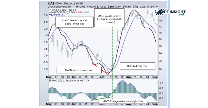
Bullish divergence
A bullish divergence signal appears when:
MACD forms two lower lows
But the histogram forms two higher lows
This suggests that even though MACD is dropping lower, the histogram shows bearish momentum is weakening, meaning selling pressure is no longer as strong as before. In many cases, after a bullish divergence, the histogram gradually rises and crosses above the zero line, signaling a high probability of a bullish crossover between the MACD line and the Signal line, potentially leading to a rebound or a reversal.
Bullish divergence example: the MACD forms a lower low, but the MACD histogram forms a higher low, signaling weakening bearish momentum and a higher likelihood of a bullish crossover.
Bearish divergence
Conversely, bearish divergence appears when:
MACD forms two higher highs
But the histogram forms two lower highs
This signal indicates that MACD is still pushing to a higher peak, but the histogram shows bullish momentum is weakening, meaning the market is losing strength even though it still “looks bullish” on the surface. When the histogram continues to contract and then crosses below the zero line, it is often a strong warning that a bearish crossover may occur and a clearer downward move may begin.
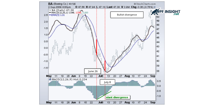
Slant divergence
Compared to regular divergence, slant divergence is harder to spot because the second peak or trough of the histogram is not clearly defined. Sometimes it appears very “faint” or almost incomplete. However, precisely because it occurs during market transition phases, it can be a highly valuable divergence type if identified correctly.
Bullish slant divergence
Example of bullish slant divergence: the histogram slope turns upward before the MACD crossover, signaling weakening bearish momentum.
Key characteristics: the second histogram trough is not clearly defined (faint) but the overall histogram slopes upward (meaning the later troughs are gradually higher)
This indicates that bearish momentum is gradually fading, even though the MACD has not shown it strongly yet. Bullish slant divergence often correctly anticipates a bullish crossover when the market is preparing to shift from a downtrend into a rebound or an upward reversal.
Bearish slant divergence
Key characteristics: the second histogram peak is almost not visible but the histogram slopes downward (meaning the later peaks are gradually lower)
This reflects bullish momentum quietly being drained. Even though the signal is not as “clean” as regular divergence, it can still provide an early warning of a bearish crossover in the following phase.
Conclusion
The MACD histogram is a tool that helps you read market momentum more clearly, especially for spotting momentum shifts before MACD crossover signals appear. By understanding how to observe the height of histogram bars, you can more easily identify phases where a trend is strengthening or weakening, as well as advanced signals such as divergence to filter for better entry points. However, the histogram works best when combined with the main trend, support and resistance zones, and confirmation signals from candlesticks to reduce noise. If you want to explore more strategies and related indicators, check out more articles in the Technical Analysis section to continue expanding your knowledge.